
Customizing Button Colors change in Fyne: A Step-by-Step Guide
Customizing Button Colors in Fyne: A Step-by-Step Guide
Fyne is a graphical user interface (GUI) toolkit for creating cross-platform desktop and mobile applications in the Go programming language. In Fyne, buttons are UI elements that users can click or tap to perform certain actions.
Creating Stylish Buttons in Fyne: How to Set Colors and Icons
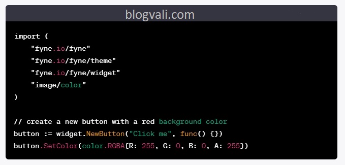
In Fyne, buttons have a default color that depends on the operating system’s theme. However, you can customize the button color using the SetColor method of the fyne.Widget interface.
Mastering Fyne Button Design: Tips and Tricks for Color Customization
The SetColor method takes a color.Color value as an argument, which specifies the background color of the button. You can create a color.Color value using one of the predefined color constants in the fyne package, or you can define your own custom color using the color.RGBA function.
Fyne Buttons Made Easy: How to Set Color and Style in Your GUI
For example, to set the background color of a button to red, you can use the following code:
fyne color change
Alternatively, you can use one of the predefined color constants in the fyne package, such as theme.PrimaryColor(), theme.AccentColor(), or theme.ButtonColor(), to set the button color to a pre-defined value that matches the system theme.
From Drab to Fab: Elevating Your Fyne App with Custom Button Colors
Further More
In addition to the SetColor method, there are several other methods in the widget.Button type that allow you to customize the appearance and behavior of Fyne buttons:
SetIcon(icon fyne.Resource): Sets the icon displayed on the button, using afyne.Resourcevalue.SetIconPlacement(position widget.ButtonIconPosition): Sets the position of the button icon relative to the button label.SetAlignment(alignment widget.ButtonAlign): Sets the alignment of the button label within the button.SetStyle(style widget.ButtonStyle): Sets the style of the button, which can be one ofwidget.PrimaryButton,widget.SecondaryButton, orwidget.TertiaryButton.Disable(): Disables the button, preventing the user from clicking it.Enable(): Enables the button if it was previously disabled.
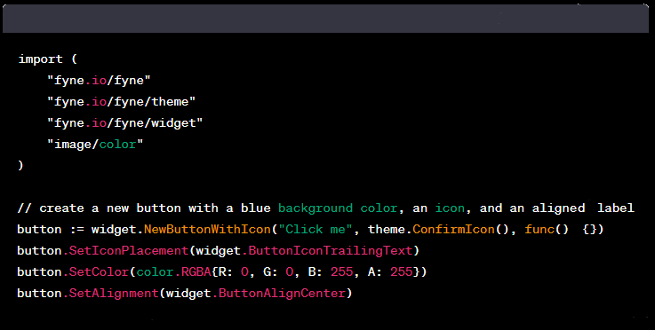
Here’s an example that demonstrates how to use some of these methods to create a custom button with a blue background color, an icon, and an aligned label:
fyne change color
This code creates a new button with the label “Click me”, a checkmark icon, and a blue background color. The icon is positioned to the right of the label (ButtonIconTrailingText), and the label is centered within the button (ButtonAlignCenter).